Logos
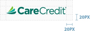
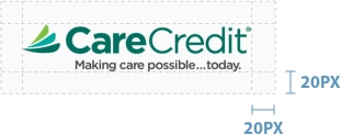
In most cases, the CareCredit logo should be used in full color across all webpages and associated elements. On most CareCredit webpages, the logo should be the first element at the top left of the page.
The CareCredit brand is removing all product based logos.
Spacing Guidelines
The logo should always be placed at a readable scale and should have at least 20 pixels of breathing room around it for digital applications in web pages and images.
Example

Example


