Provider Digital
Navigation & Footer
Navigation
Primary Authenticated
The Primary Authenticated navigation should be used on all pages of an authenticated experience and visually indicate which section a user is in.

Primary Unauthenticated
The Primary Unauthenticated navigation should be used on all pages of an unauthenticated experience and visually indicate which section a user is in.

Category Tabs
The Category Tabs are used on the category pages and indicate which category a user is in.

Category Tabs
The Category Tabs are used on the category pages and indicate which category a user is in.

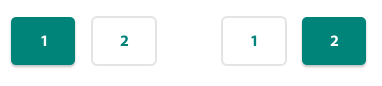
Pagination
Visual styling of a pagination control.
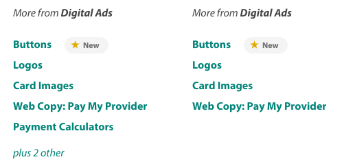
Related Content
Related Content should be used within the sidebar of a content page and display links to content related to the page’s topic. If the amount of links is over six, the list should be limited to five and include a link back to the category page (i.e. ‘plus # other’).
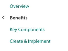
Side Navigation
Side Navigation shall be used on each content page within a content section (e.g., Financial Policy).
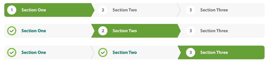
Wizard Header
The Wizard Header is used as a progress indication for sections within a wizard flow. The sections shall be clickable to navigate backwards once completed.
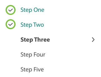
Wizard Steps
The Wizard Steps should be used as indication and navigation between steps within a sections of a wizard flow. An indication of completion should be displayed for each step a user has completed and progressed from. Future steps can be made clickable (#008378) if should be desired.
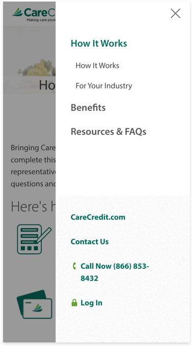
Mobile Navigation Bar
Example

Level 1
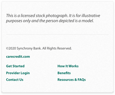
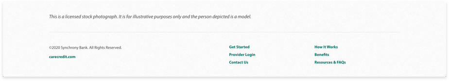
Footer
The Footer style should be used at the bottom of each page within the Provider Center.
Example
Mobile Footer
Example