Visual Design
Our brains process visuals much more quickly than they process text, so try to use visuals to help get your story across.
Visuals are much more memorable, too. We retain them better than we retain words.
Consult our overall Brand Guidelines for guidance on typefaces, colors and logo usage. But here are a few specific pointers relating to video:
Colors
Keep it clean. Our brand should not feel heavy, dark or complicated. Use the main colors from the brand palette, and use lots of white space—we like the clean, fresh look that comes with using lots of white.
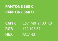
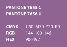
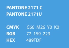
Brand colors that are particularly good for backgound colors of title slides:


Backgrounds
Keep backgrounds simple. When using type on a colored background, use the main brand colors, and white type usually works best on colored backgrounds.
Be careful when using colored type on colored backgrounds; the wrong combinations can cause the type to "vibrate" and be distracting to the eye.
Complicated backgrounds can confuse and distract the eyes, so always ask yourself, "Does this advance the storytelling, or does it get in the way?"
Typography
Don't go crazy with type variations. Don't use too many sizes and styles of typefaces. When you give people too much to visually absorb, it detracts from your main message. Keep the type relatively uniform in size, and don't use too many fonts, weights and variations (italic, bold, etc.). You may think it's making things more interesting, but it really may be getting in the way.
Visual Effects
Use visual effects for emphasis, but make sure they're not distracting. If you're using type effects or motion graphics, make sure they're helping reinforce your point, and not just superfluous or there as "eye candy." Everything you do should serve the point you want to make.
Always remember, you're helping people understand something. And they always have a choice to stop watching at any time, so your goal is to keep connecting with them and giving them useful information.
When looking at some of the videos we've done in the past, we've been a bit too tricky at times with visual effects—they don't really enhance the story, and they just make everything busier, not necessarily clearer.
So, again, if it doesn't help with communication, don't use it.
Drop Shadow
Use drop shadows sparingly. When using type over images, keep the underlying images simple and graphic. If images are too busy it will create all kinds of difficulties with reading the type.
Ideally, you should not have to use drop shadows on type to enhance readability. But sometimes, it's necessary when type is over an image—use them carefully and sparingly. Better yet, choose a simpler background that won't require drop shadows.
If an image seems too busy, see if you can crop it in a more interesting way to make the image simpler overall. Look for the "shot within the shot."

